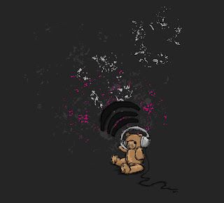
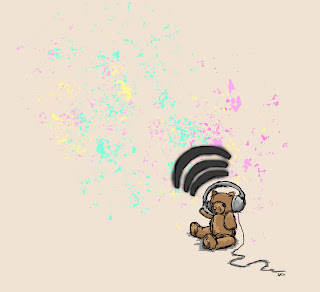
 Haven't been up to much graphics wise lately. Got back into playing with my camera so I'm finding all the tools in PS really fun for manipulating! Also now purely using PS for pixel drawings etc. My friend Erik will kill me for doing so! He says that's what Illustrator's for. But well my version of Illustrator is WAY out of date and it's SO restricting! Really like sketching in PS. Thinking of trying some vector art. This piece is just something I've been mucking about with. It's drawn from a photograph originally and then added to a little. Inspired by the band sunnO))) as well (pronounced sunn). I've got about a thousand layers in this psd file!! Want a nickel of free advice? NAME YOUR LAYERS WHEN YOU CREATE THEM. That way when sifting through tons of them you know which each tiny bit it. What's the outline of what, what's the colouring of what etc. Really handy when you end up with loadssss of stuff!! I originally made this image on a pale creamy background with more multicoloured splashes (look below) btu I've done several other versions. I like dark stuff too and pink hence the one above. And my partner asked me to make him a couple of more macho versions in white and red. They turned out pretty cool but these two are definitely my faves.

3 comments:
Layers are great.
Duplicate a layer, try something out and then delete if it doesn't work.
I'm developing a bad habit of duplicating a layer, darkening the lower layer, and dropping the upper layer's opacity to 50%. Try it with one layer in greyscale, and the lower one in colour. If you want more colour to show through, just erase part of the upper layer.
oooo thats just too cute*steals the bear*mine now mwhahahahhahahah i feel quite random right now
no! my bear!! (haha i have the bearin real life nananana)
Post a Comment