Tuesday, 4 December 2007
Sunday, 18 November 2007
Flash animations
Wednesday, 31 October 2007
Tuesday, 30 October 2007
Animated Face using Flash
Monday, 29 October 2007
A lack of apostrophes is bugging me
Just out of interest (and a current fight I'm having with many people) - how does everyone here spell Hallowe'en? Have you all been taught that it has an apostrophe or not? Apparently Aberdeen schools are teaching the lazy American spelling without the apostrophe and kids don't even know why there should be one.
For those who don't know, maybe you shouldn't celebrate Hallowe'en until you do. Hallowe'en has an apostrophe because it is two words combined. This is known as a Contraction Apostrophe. The words combined are Hallows and Evening. Hallowe'en is the eve of All Hallows. Also known as All Saints Day. So Hallowe'en is when all the ghouls come out for a party before the goody goody Saints do on All Saints Day.
So come on, own up, who doesn't use the apostrophe? Who didn't even know there should be one?
Sunday, 28 October 2007
sunnO))) bears
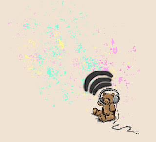
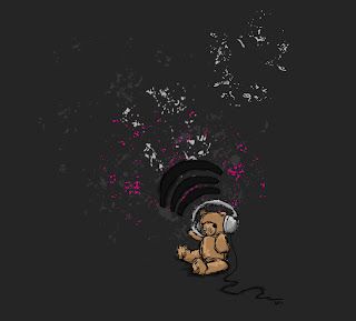 Haven't been up to much graphics wise lately. Got back into playing with my camera so I'm finding all the tools in PS really fun for manipulating! Also now purely using PS for pixel drawings etc. My friend Erik will kill me for doing so! He says that's what Illustrator's for. But well my version of Illustrator is WAY out of date and it's SO restricting! Really like sketching in PS. Thinking of trying some vector art. This piece is just something I've been mucking about with. It's drawn from a photograph originally and then added to a little. Inspired by the band sunnO))) as well (pronounced sunn). I've got about a thousand layers in this psd file!! Want a nickel of free advice? NAME YOUR LAYERS WHEN YOU CREATE THEM. That way when sifting through tons of them you know which each tiny bit it. What's the outline of what, what's the colouring of what etc. Really handy when you end up with loadssss of stuff!! I originally made this image on a pale creamy background with more multicoloured splashes (look below) btu I've done several other versions. I like dark stuff too and pink hence the one above. And my partner asked me to make him a couple of more macho versions in white and red. They turned out pretty cool but these two are definitely my faves.
Tuesday, 16 October 2007
Victorian Curtain drawings update :s
Currently doing more research on the Victorians for my group project. Learning stuff about schools now, I looked at their fashion the other day. We finished our mockups the other day in PS so nothing else but the next stages to do I spose. My curtain design needs rethinking perhaps... well... redrawn I guess. I'll probably try doing it with the graphics tablet instead of the mouse as my mouse drawn curtains are....
Saturday, 13 October 2007
Pixel Perfect
Anyone watch any of the Rev3 podcasts? I've been watching diggnation for over a year now but they've started making so many others I thought I'd have a read about some and then download a few on iTunes. Watched The Totally Rad Show last night It was rubbish. I fell asleep! Alex Albrecht needs Kevin Rose or to just be on his own. His co-hosts on The Totally Rad Show are so very very dull! Watched a few episodes of the Rev3 Gazette - so boring and not at all THAT insightful. But I was slightly impressed by Pixel Perfect. The hosts are pretty weird/annoying/dull/boring BUT they have some great tips for doing stuff in Photoshop. In this week's episode they have great tips on smart objects, layer filters, multiplying to get transparency and making pirate text. I've a feeling I'll learn a lot of good stuff from this podcast despite the boring presenters. You should check it out for free on iTunes or on the Rev3 site: http://revision3.com/pixelperfect
Thursday, 11 October 2007
Coloured bear
1st Class Night Out
To everyone who didn't come out to the class night out last night - you missed a good time!! Yay to everyone who did come out :D
Wednesday, 10 October 2007
Tuesday, 9 October 2007
Street Art Design started...
Started making a layout design for my Street Art website. Just whipped this up in Photoshop. I used loadssss of different brushes. The dry and wet ones were really useful. Also did some rotating, scaling, canvas and image resizing, messed about with lighting, contrast, hues, filters and effects. I wouldn't say my drawing is that cool but I spose it's the best I could do to look like graffiti! :)


WIP - 1880 Reception Dress
Portfolio Work Raster Pt2.5/Westhill Primary Work - 1880 reception dress sketch
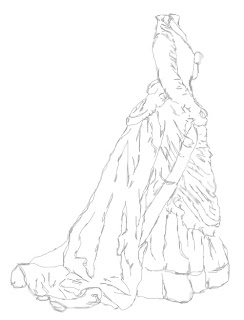
As part of a group project I have to design three pages and a stylesheet for a website on the Victorians. My three pages are to be on the subject of Victorian Fashion & Schooling and how they are different to our modern day equivalents.
I've been researching Google, Google Images etc finding images for my pages and I've started work on something for the layout images. Just a rough sketch based on an 1880 Reception Dress. :D
Monday, 8 October 2007
More on miniaturizing
I found another slightly more detailed tutorial online for miniaturizing, it's pretty much the same as the one in Wired except it specifies which blur filter to use, turns out it was the one I was using! >>> http://recedinghairline.co.uk/tutorials/fakemodel/
For more pix of fake miniatures try typing Tilt-shift Photography into Google Images or look at the faked versions on the Flickr pool - Tilt-shift miniature fakes pool.
For more pix of fake miniatures try typing Tilt-shift Photography into Google Images or look at the faked versions on the Flickr pool - Tilt-shift miniature fakes pool.
Sunday, 7 October 2007
More miniaturizing!
 I wasn't completely happy with the way the first attempt at miniaturizing the Apple Store photograph went so I tweaked it again.
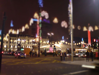
This is George Square last Christmas. I took it with my cameraphone and I'm glad I know how to use Photoshop a bit better now because it needed some tweaking before I miniaturized it. Cropped and rotated a bit etc. I think this one's turned out really well :)
Miniaturizing
Anyone read the US Oct 2007 Wired? I got it in Borders in Glasgow today and found an ace wee quick tutorial for Photoshop in it (pg 56). Has anyone seen those photos of real life scenes that have been either photoshopped or photographed with a tilt-shift lens so that they look like everything is in miniature as if you've photographed a scale model? Well it's SO easy to do in Photoshop and only takes a sec to do! I tried it on some photographs I took in Glasgow over the weekend...
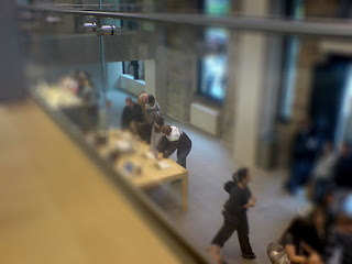 The Glasgow Apple Store - in miniature!
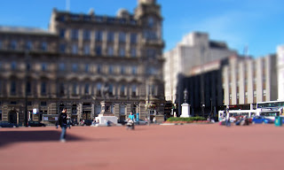 George Square earlier today - except now it looks like toy buses and cars!! :)
I found the tutorial on Wired's online magazine site if anyone wants to have a go:
http://www.wired.com/culture/lifestyle/magazine/15-10/st_howtoscene
 The Glasgow Apple Store - in miniature!
 George Square earlier today - except now it looks like toy buses and cars!! :)
I found the tutorial on Wired's online magazine site if anyone wants to have a go:
http://www.wired.com/culture/lifestyle/magazine/15-10/st_howtoscene
Friday, 5 October 2007
Class night out
Hey everybody. Incase you've missed it on Dave's blog - class night out next Wednesday (10th October). Meet 7pm at The Moorings Bar. If you don't know where it is it's on Regent's Quay down by the harbour.
Portfolio Work Raster Pt2.4 - Purple Woods
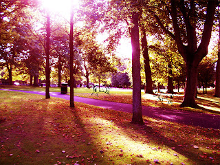 Click to enlarge. Look closely to see who's in the woods!
For this I used a photograph I took recently of Victoria Park, Aberdeen and some images I created previously using PS's drawing brush tool. I resized the image, imported the drawings onto new layers and resized them. I changed the hue, saturation, gamma, lighting and colours of the photograph and darkened the drawings. I flipped them as well. Think that's about it! Some blurring too...
Portfolio Work Raster Pt2.3 - Lights manip
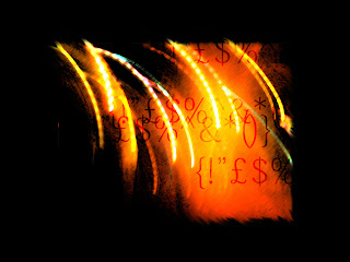 This was originally a photograph I took at night with my camera phone. It used to be a series of coloured lights from a roundabout and brightly lit street near the top of Union Street, Aberdeen. First I resized the image then resized the canvas increasing it to 150%. I filled the background layer in black to match the photograph and then used the Dark Strokes filter on the image. I adjusted the saturation and contrast of the photograph and then added anti-aliased text. I made the text overlay the image and finally smudged and blurred the edges of the lights in the photograph to make them more... spikey. :P Quite pleased with the result. :D
Portfolio Work Raster Pt2.2 - Lil' Fly
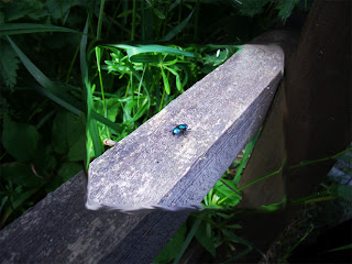 Took this photo a while ago now... enjoyed messing around with it here. I was going to crop it but when I was in the middle of doing so photoshop gave me the idea to merely frame it using contrast and brightness. Then since I hate hard lines I used the smudge tool. I also used resize image, hue and saturation.
Portfolio Work Raster Pt1.5 - Animated GIF
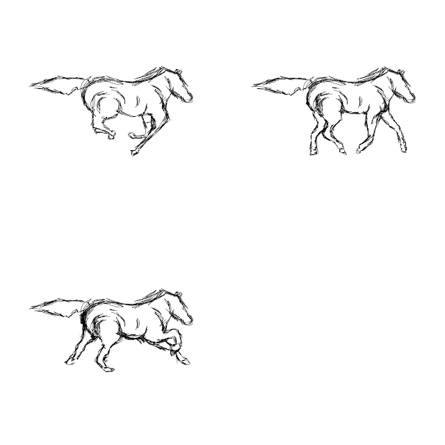 This was really fun to do. I'd already drawn the horse for something else so I just adapted it and redrew it in different positions to create the frames. I'm really getting the hang of using layers and using them to make frames for an animation was relatively easy. :D The horse is based on Agro from Shadow of the Colossus. Click the preview image to see the animation work.
By the way I drew this with my mouse not a pen tablet. Still haven't bought one of those. A Bamboo Wacom would be very well received ;D
Tuesday, 2 October 2007
Portfolio Work Raster Pt1.4 - Personal Label
Portfolio Work Raster Pt1.3 - Teddy's t-shirt
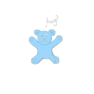 Boo...! It's smaller than I would have liked but this is my image (ahem doodle) for the teddy bear's tshirt. It's as cute as I could manage lol. I usually do this technique in Paint Shop Pro but PS behaves differently so I used layers instead and found it was quite easy still to do it. Perhaps even tidier feeling. I'm glad with the way it turned out.
Portfolio Work Raster Pt1.2 - Winter Festival Card
Umm argh? :P I really enjoy doing this stuff but I feel like I'm being slow and falling behind :( Tried to do some at home but my Photoshop is being rubbish and is missing the animation window among other things. I can't create exact ppi's and other stuff either. How hard is it to make 16bit? So I thinks I need a new version of PS!! Also - anyone noticed that none of the Adobe CS3 web suite is installed in the IT Centre? How are we supposed to do work outside of class on Fireworks, Dreamweaver, Flash or PS? Oh and wanna know something more stupid? - The IT Centre doesn't have Flash plug-ins installed either. If they don't want people looking at flash games and stuff just block the sites!
So here's the start of my Portfolio work - image for a Winter Festival card :D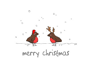 I tried it in greyscale, without any fills and with pastel colours but this looked best using the correct colours. On to the next! :D
So here's the start of my Portfolio work - image for a Winter Festival card :D
 I tried it in greyscale, without any fills and with pastel colours but this looked best using the correct colours. On to the next! :D
Monday, 1 October 2007
Tuesday, 25 September 2007
Advice please :)
Does anyone have a graphics tablet? I've been thinking about getting one for a couple years now and I think I'm definitely in need of one now. I think I'd probably get a Wacom but even then they have so many different models I'm not sure which one is best. I don't want one for office programs and signing my signature. The new Bamboo range looks good, I'm considering the Bamboo fun. Looks pretty good. Anyone have one already? Know any good ones?
Portfolio Work Raster Pt1.1 - Business Card
Design brief: create business card with just photoshop tools & text, no graphics or photographs. Greyscale.  So I didn't know what else to do except draw pixel scribbles :) They're fun but I found it more difficult than usual. I usually draw them in psp but in ps it's harder because the cursor is almost invisible! Got there in the end though :D I guess I quite like the end result. Georgia's one of my favourite fonts and I quite like light grey and white colourschemes. Used it quite a lot in the past in site designs.
 So I didn't know what else to do except draw pixel scribbles :) They're fun but I found it more difficult than usual. I usually draw them in psp but in ps it's harder because the cursor is almost invisible! Got there in the end though :D I guess I quite like the end result. Georgia's one of my favourite fonts and I quite like light grey and white colourschemes. Used it quite a lot in the past in site designs.
Java dev con
Hey did anyone go to the Sun Microsystems Java talk thing last Thursday?
I got one of those t-shirts. Dunno if I'll wear it though... I'm not sure I want people to think I don't wear pants when I program Java >.<
Also, can anyone think of an actual use for sun spots? Other than to be geeky of course :D
I got one of those t-shirts. Dunno if I'll wear it though... I'm not sure I want people to think I don't wear pants when I program Java >.<
Also, can anyone think of an actual use for sun spots? Other than to be geeky of course :D
Tuesday, 11 September 2007
Photoshopped photographs
We get to play with photoshop in class. Can't get much better than that :D
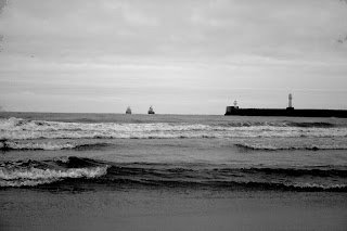
First photo has been lightened, desaturated and more. Second one has been cropped into a panorama of the beach, I fiddled with the levels a bit too. The third photograph I cropped into a panorama so that the photograph focused on the building and in the last photo I fiddled with the levels and added something in :)


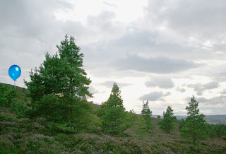
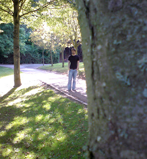
Colin in Seaton Park.
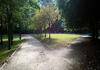
Seaton Park Trees
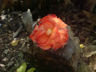

First photo has been lightened, desaturated and more. Second one has been cropped into a panorama of the beach, I fiddled with the levels a bit too. The third photograph I cropped into a panorama so that the photograph focused on the building and in the last photo I fiddled with the levels and added something in :)


Colin in Seaton Park.

Seaton Park Trees

Monday, 10 September 2007
Friday, 31 August 2007
Halo nameplate
Tuesday, 28 August 2007
Claire's nameplate n stuff
I'm too warm.
I want a smoothie. An Innocent Smoothie :) With passion fruit and mango... yummmm!
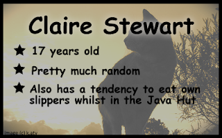
Btw - I made Claire a nameplate. Here it is:
I want a smoothie. An Innocent Smoothie :) With passion fruit and mango... yummmm!
Btw - I made Claire a nameplate. Here it is:

Subscribe to:
Comments (Atom)


